1. Describe in detail the image, and why you believe the company selected the brand elements (color, size, layout, character, etc.) that they did. Your analysis should include a brief description of the competitors and how your selected brand logo compares. In other words, why did they choose the brand elements that they did.
The Panera bread logo stood out to me because of its simplicity at first glance, and how it is easily overlooked. However, if you look at it for longer than a few seconds you can see there was much thought and research put into the logo. As you can see, the logo is subtle earthy colors with a woman holding a loaf of bread. The logo is simple however is complex in a way that it has a story behind the design. Panera although having more available than bread, includes a woman who they consider the “Mother of bread”. To understand the logo fully, one has to know that while making their famous sourdough, the bakers use a small amount of dough used to cook the previous batch of bread dough in the new one, and thus calling it the “mother”.
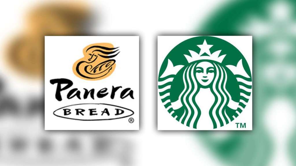
Panera Bread’s top competitor would probably be Starbucks and other local restaurants that serve sandwiches, soups and salads as they have similar menu to an extent. Starbucks has a similar logo in the aspect that they also have a woman as the main element of their logo, however Starbucks appeals more to a younger generation than Panera does through their more modernized, detailed logo.
2.Describe the target market (ie. what segments are being targeted)? How do you know this is the target market? Did the company make good decisions to reach the target market?
From the design alone, from the subtle earthly colors represented and the “Mother of Bread”, the market Panera Bread is targeting is a young adult to mother. The font is a more calligraphy-like and flowy letter appealing to young adults trying to get away to a quiet location to work on work or homework. The lettering also appeals to mothers trying to get away from their kids for a little bit to meet up with old friends, or just for a break. The “Mother of Bread” makes it appealing to these mothers as they can relate to her and her calmness shown on her face. I think the company did make good decisions regarding the target market because people in these categories want to get away and feel calm, and with the subtlety of the logo I think they accomplish this goal.
3. Does it work? Why or why not? Any general observations?
From the perspective of someone close to being in their target market, I believe it does work. Going in a Panera 90% of the customers are young adults and middle-aged women meeting with old friends or working on tasks on their computers. I think that they put a lot of thought into their logo and although not many people understand the true meaning behind it, is still visually appealing to their target market through their subtle colors and lettering.
 Alex Friesen