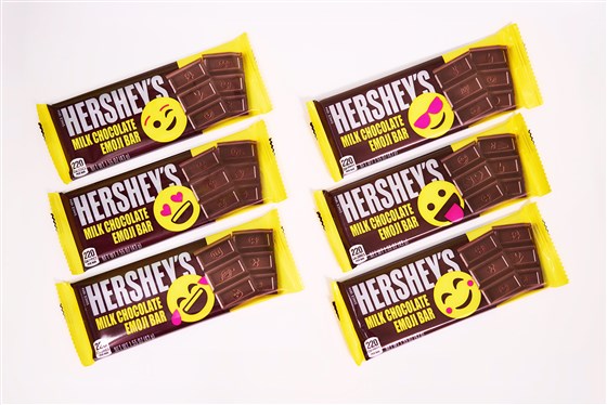
Describe in detail the image, and why you believe the company selected the brand elements (color, size, layout, character, etc.) that they did. Your analysis should include a brief description of the competitors and how your selected brand logo compares. In other words, why did they choose the brand elements that they did.
Hershey’s has had the same logo and stamp on their chocolate bars for the entirety of the 125 years their brand has been around. Although Hershey’s is a well-known and recognizable brand, I think them changing their packaging and stamp was a very smart marketing decision. Texting/ emojis is a huge part of todays young generations and society, changing their face of their product to something that is going to draw the younger crowd in was very smart on their part. Hersheys is a simple chocolate and one of their top competitors are Dove chocolates, prior to now they had very similar, simple packaging. Now with hersheys having the bright circular face on their product, they are able to draw in kids and family’s more than Doves simple packaging is able to. Hershey’s changing their packaging is going to help them reappear and stand out to todays younger generations.
Describe the target market (ie. what segments are being targeted)? How do you know this is the target market? Did the company make good decisions to reach the target market?
The target market that Hershey’s is targeting in changing their packaging is young familys and children. We know this is the target market because they are adding bright colours and funny faces to the front of their packaging and on the physical chocolate bars as well. This is a way to draw young kids in and then proceed to convince their parents to buy it for them because they want to see what different emojis they are going to get on their bar. I think that Hershey’s did make good decisions to reach this target market because there isn’t a lot out their similar to their strategy. For a simple chocolate bar that has many competitors, Hershey’s made a wise decision in rebranding their product to appeal to the younger generations.
Does it work? Why or why not? Any general observations?
It does work because chocolate bars are always located near the tills of stores. While parents are shopping with their kids, children often get bored and look at the shelves surrounding the check-out areas. The bright yellow face on the Hershey’s chocolate bars are going to capture the eyes of the kids. The kids will then proceed to ask their parent to purchase a bar for them, since they are already at the check-out, parents are more likely to agree to buy the Hershey’s bar for their kids. Hershey’s is finding a new way to stand out against competitors with their new packaging and stamps and I believe it was a very smart decision on their part and will help boost their sales and revenue in the end.

 Alex Friesen