
Describe in detail the image, and why you believe the company selected the brand elements (color, size, layout, character, etc.) that they did. Your analysis should include a brief description of the competitors and how your selected brand logo compares. In other words, why did they choose the brand elements that they did.
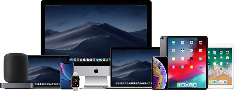
Apple is one of the top brands in the world, their logo is recognizable everywhere and by everyone. They chose a simple, cutting edge apple as their logo to show that their brand is high end and new. Apple’s logo compares to other companies and brand logo’s because they have a symbol that is recognizable. Compared to HP or Dell, Apple is different because it does not have its name in its logo. Apple doesn’t need the word “apple” for people to recognize the brand. They chose the brand elements that they did to stand out against competitors and to be a well known name.
Describe the target market (ie. what segments are being targeted)? How do you know this is the target market? Did the company make good decisions to reach the target market?
Apple has a very large target market, however they have the reputation of being slightly more expensive than other competitors. Their target market is thus more people with a medium to higher class income. We know this is the target market because of their simplistic, cutting edge logo and the branding they do for their company. Their advertisements are always modern and clean to showcase the cutting-edge of their brand.
Does it work? Why or why not? Any general observations?
I think that Apple’s marketing strategy for their logo and their brand is very smart and works very well for them. Being one of the most recognizable brands in the world and having a logo that everyone automatically associates with the Apple company. The crystal cut and simplicity of their logo is what makes it so recognizable, and showcases their brand.
 Alex Friesen