7.2

Image result for 10 tree

Describe in detail the image, and why you believe the company selected the brand elements (color, size, layout, character, etc.) that they did. Your analysis should include a brief description of the competitors and how your selected brand logo compares.  In other words, why did they choose the brand elements that they did. 

10 tree is an apparel company that strives to help the environment while also selling top quality clothes. With everything you purchase, they will plant 10 trees in a country that needs it. I believe 10 tree selected the elements in their logo that they did because they wanted a simple feel but also something that showed what they are all about. The simple 10 with the tree growing inside the 0 is simple but accomplishes their goal, eludes to the fact their company is striving to help the environment and the planet.

Describe the target market (ie. what segments are being targeted)?  How do you know this is the target market? Did the company make good decisions to reach the target market?

I believe that the target market is millennials and people looking to make a difference in the environment and on the planet. I believe that Ten Tree has made good decisions to reach this target market as people automatically know the vision for their company the minute they look at the brand and logo. The warm and earth toned colours display a calm and collected company with a vision for the world. They did a very good job marketing their company and vision through their logo.
Image result for 10 tree

Does it work? Why or why not? Any general observations?

I do believe that Ten Tree’s strategy does work. Although they are not well known by everyone, they are recognizable to the people that matter. They have done a good job marketing their company to people who care, not people who have no interest in anything they are doing or what they stand for. Although in some areas I believe they could make their brand more known, I believe their logo does a good job representing what they stand for and their brand as a whole. They are a well marketed company in the areas and places that truly matter in the sense of the success of their company.

Image result for 10 tree clothing

7.1

American Eagle Outfitters Logo

Describe in detail the image, and why you believe the company selected the brand elements (color, size, layout, character, etc.) that they did. Your analysis should include a brief description of the competitors and how your selected brand logo compares.  In other words, why did they choose the brand elements that they did.

American Eagle Outfitters is a well-known teenage clothing company. Their logo is very simple yet modern. The navy and white eludes to it being an american company as those are the flag colours (without the red). Their major competitors are companies like Hollister and Aeropostale, who also have very simplistic, “american colours” logos. American Eagle stands out against its competitors because their bird in their logo is more distinguishable and relates to their name. Hollister does not have a type of bird in their name so therfore people don’t associate the bird with their logo/company as much.

franelas y chemises aeropostale, hollister, abercrombie y ae

Describe the target market (ie. what segments are being targeted)?  How do you know this is the target market? Did the company make good decisions to reach the target market?

I believe American Eagle Outfitter’s target market is young adults and teenagers. We know this is the target market based on the style of clothing they carry and the models they use to market their brand. I believe that the company does make good decisions to reach their target market as they are a well known brand and worn by teenagers and young adults everywhere. In making their logo simple, but meaningful theu have created a recognizable brand that most people automatically recognize.

Does it work? Why or why not? Any general observations?

Yes I believe it does work because they have created a name for themselves through their logo and their marketing strategies. Although Hollister will always be a close competitor simply due to the fact that they have very similar prices, style and logo, I believe American Eagle stands out as a recognizable brand amongst their competitors. The simplicity of their marketing strategy allows people to recognize their brand name from all over the world.

6.2

Describe in detail the image, and why you believe the company selected the brand elements (color, size, layout, character, etc.) that they did. Your analysis should include a brief description of the competitors and how your selected brand logo compares.  In other words, why did they choose the brand elements that they did.  

Pillsbury’s iconic doughboy is recognizable all over the world by just about anyone. I think that the Pillsbury dough company did an amazing job with their iconic mascot and it is one of the main reasons their products are so recognizablee. Nestle tollhouse is a large competitor of Pillsbury as they aslo sell baking goods and supplies, Pillsbury stands out against them because of their inviting doughboy. The chose this huggable, chubby dough man because it is a friendly face to draw in family’s with a sweet tooth.

Describe the target market (ie. what segments are being targeted)?  How do you know this is the target market? Did the company make good decisions to reach the target market?

The target market I belive Pillsbury is mainly targeting is family’s and older generations. People who love to bake tend to be in the Generation X to Baby boomer age range. This huggable little guy functions as a friendly face to draw in people looking to bake for their kids or grandkids. I think that the company did make good decisions to reach the target market because they are targeting a group of people who want to trust the ingredients and baked goods they are using. The very trustworthy and sweet face of the doughboy allows consumers to believe what they are using is safe and good for kids.

Does it work? Why or why not? Any general observations?

Because Pillsbury has been such a well-known company and their logo and doughboy is so recognizable I do believe their initial marketing strategy when they created the dough boy is working. Pillsbury having not changed their logo in in almost 60 years and still remaining ontop proves that their marketing strategy all those years ago was on point and still is today. Their doughboy is adorable, trusting and inviting to anyone looking to make their baked goods and meals for those special people in life.

Pillsbury™ Original Crescent Rolls

6.1

Describe in detail the image, and why you believe the company selected the brand elements (color, size, layout, character, etc.) that they did. Your analysis should include a brief description of the competitors and how your selected brand logo compares.  In other words, why did they choose the brand elements that they did.  

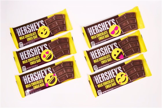
Hershey’s has had the same logo and stamp on their chocolate bars for the entirety of the 125 years their brand has been around. Although Hershey’s is a well-known and recognizable brand, I think them changing their packaging and stamp was a very smart marketing decision. Texting/ emojis is a huge part of todays young generations and society, changing their face of their product to something that is going to draw the younger crowd in was very smart on their part. Hersheys is a simple chocolate and one of their top competitors are Dove chocolates, prior to now they had very similar, simple packaging. Now with hersheys having the bright circular face on their product, they are able to draw in kids and family’s more than Doves simple packaging is able to. Hershey’s changing their packaging is going to help them reappear and stand out to todays younger generations.

Describe the target market (ie. what segments are being targeted)?  How do you know this is the target market? Did the company make good decisions to reach the target market?

The target market that Hershey’s is targeting in changing their packaging is young familys and children. We know this is the target market because they are adding bright colours and funny faces to the front of their packaging and on the physical chocolate bars as well. This is a way to draw young kids in and then proceed to convince their parents to buy it for them because they want to see what different emojis they are going to get on their bar. I think that Hershey’s did make good decisions to reach this target market because there isn’t a lot out their similar to their strategy. For a simple chocolate bar that has many competitors, Hershey’s made a wise decision in rebranding their product to appeal to the younger generations.

Does it work? Why or why not? Any general observations?

It does work because chocolate bars are always located near the tills of stores. While parents are shopping with their kids, children often get bored and look at the shelves surrounding the check-out areas. The bright yellow face on the Hershey’s chocolate bars are going to capture the eyes of the kids. The kids will then proceed to ask their parent to purchase a bar for them, since they are already at the check-out, parents are more likely to agree to buy the Hershey’s bar for their kids. Hershey’s is finding a new way to stand out against competitors with their new packaging and stamps and I believe it was a very smart decision on their part and will help boost their sales and revenue in the end.

5.2

Describe in detail how the business implemented the four P’s to add value and/or promote the product or service. 

Price: Rocket Mortgage advertised their services through explaining how they help you with personal and convenient experience centered around you. They did not advertise a price but rather how their company can help you.

Promotion: In using Jason Momoa in their commercial who is a well known actor and known for his strength and buffness, they stood out. They grabbed peoples attention when he “took off his muscles” because he was able to just “be himself” at home. This was very smart promotionally speaking for Rocket Mortgage because they could relate to this statement and imply their company allowed their customers to be themselves.

Place: Using the SuperBowl as their first form of displaying their commercial was very smart because the agegroup that tends to watch the SuperBowl is also mostly likely paying a mortgage, but also would recognize and enjoy seeing Jason Momoa in a commercial.

Product: They were able to promote their product through an eyecathcing and funny commercial. Although many people don’t often think of laughter when talking about a mortgage payment, they made their commercial entertaining to promote their product to a crowd that needs it.

Describe the target market (ie. what segments are being targeted)?  How do you know this is the target market? Did the company make good decisions to reach the target market?

I believe that the target market was middle aged men and women. The people who tend to have a mortgage payment to be thinking about usually fall into the middle class middle aged range. I think that the company did make good decisions to reach the target market being as Jason Momoa falls into this age group as well as he is known for his role of Aquaman in the DC comics movies. These movies tend to appeal to this agegroup as well so he was a funny recognizable face in the commercial to draw people in.

Does it work? Why or why not? Any general observations?

I believe that their marketing strategy did work because they brought joy and laughter to a subject that normally one would not find entertaining. They drew people in with a well-known face and smart way of promoting their service in a way that customers can “be themselves”. Mortgages can be a scary thing and in implying that customers will receive a personal and caring experience with Rocket Mortgage is a very smart marketing plan. They also did a good job appealing to their target market through their choice of using the SuperBowl as their first form of displaying their ad and their product promotion.

5.1

Describe in detail how the business implemented the four P’s to add value and/or promote the product or service. 

Price: The price of the product was not advertised in this ad, as they were promoting their brand and the new jeep. Their goal is to draw people in through the product not the price.

Promotion: They marketed the new jeep through using the “Groundhog Day” movie and advertising through it that “No day is the same in a Jeep Gladiator”. They promoted their product through the use of a well known movie with the same premise.

Product: Jeep is known for their offroad capabilities and they did not fail to display this in their new Groundhog Day ad. In using the setting of the movie with the snow and other offroad areas they were able to promote and showcase their product in the same way they always have but in a more eyecatching and interesting setting.

Place: The place in which they chose to film this commercial was a prime spot because through it they can showase rough terrain that Jeep has traditionally been known for. However through the use of the plot of the Groundhog movie they were able to draw in a crowd that they maybe would have not been able to without it. Choosing the SuperBowl as their first form of displaying their ad was very smart on their part because the SuperBowl was actually on GroundHog day and there was millions of people watching.

Describe the target market (ie. what segments are being targeted)?  How do you know this is the target market? Did the company make good decisions to reach the target market?

I believe the target market segments being targeted are middle-aged men. We know this is the target market because the agegroup of people watching the SuperBowl who also grew up watching the GroundHog movie. This commercial would not make much sense to someone who had not seen the movie, however for this agegroup that is interested in off road all-terrain vehicles, it was a clever marketing strategy to reach their target market.

Does it work? Why or why not? Any general observations?

I think that Jeep’s marketing strategy did work, in many families watching the Groundhog day movie on Groundhog day is a yearly tradition. For myself personally I had watched the movie right before the SuperBowl so when the commercial my whole family fell in love with the ad because it was fresh in our minds. For people who grew up watching Bill Murray in this classic movie and then to see the same scenes again in a commercial, was a great marketing strategy. I think that Jeep did a good job appealing to their Target market through their use of implementing the 4 P’s.

4.2

Describe in detail how the business implemented the four P’s to add value and/or promote the product or service. 

Price: The price of this product was not specified in this ad, as they were advertising the functions of google on their various products. They were getting the word out more than trying to get people to purchase specific products.

Promotion: They promoted this product in the sense that they made the advertisement sensable and that people of all ages can use it. In having an elderly man being the narrative of this ad, it implies that people of older generations have the capability to understand how to use it functions.

Place: The product is advertised to work anywhere. They made a great choice in choosing the Super Bowl as their first platform of displaying the advertisement. People of all ages and all over the world watch and so they could appeal to wide audience.

Product: The product was promoting googles ability to remember things you tell it to. Such as to remember where you placed your wallet when you got home from work. However this ad took the approach with advertising that the product can also remember specifics about people you love and care about.

Describe the target market (ie. what segments are being targeted)?  How do you know this is the target market? Did the company make good decisions to reach the target market?

I believe the target market segments that are being targeted are people of all ages. The purpose of their commercial and using an elderly man was to advertise that their product was usable by people of all ages. We know this target market because the old man is discussing the timeline of his life with his wife and asking google to remember for him. Through the sensibility in this ad they reach the younger crowds because of how cute it is but also show the older generations that it is usable by everyone. I think that the company did make good decisions to reach the target market and chose a great platform to first introduce their commercial.

Does it work? Why or why not? Any general observations?

I think that it does work because although it was not bright and flashy, it was sad and touching and got everyones attention. It was able to touch people of all ages and get everyone to stop and watch. In some aspects their ad was not succesful in promoting a product because they already know that pretty much everyone knows what google is and uses google. However it was successful in making it memorable, people will remember this commercial for a long time even if they won’t remember a specific product it was associated with.

4.1

Describe in detail how the business implemented the four P’s to add value and/or promote the product or service. 

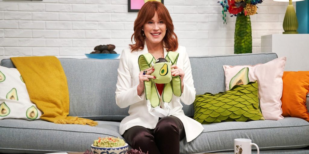
Price: Although the price of this product was not specified in the commercial, the Avocados from Mexico are advertising more about their product than about the price.

Product: The product is advertised through this commercial as being fresh and straight from Mexico to stand out against competitors.

Promotion: Through this commercial they are putting a spin on traditional produce advertisement and appealing to families through drawing them in through entertainment that appeals to younger audiences.

Place: Avocados are typically eaten at home with the family or in large groups at a party. This Avocados from Mexico ad targets just this. It advertises

Describe the target market (ie. what segments are being targeted)?  How do you know this is the target market? Did the company make good decisions to reach the target market?

The target market segments that are being targeted are a younger family oriented group. We know this is the target market because the avocado is dressed up like a child and taken through the different aspects of parenting. This appeals to new families and provides entertainment to people of all ages. I think that the company did make good decisions with the target market as it makes people laugh while still explaining their product and advertising what they are offering to their target market.

Does it work? Why or why not? Any general observations?

I think that it did work, and I also think their choice as using the Super Bowl as their first platform of airing the commercial was extremely smart on their part. People of every single age and background watch the Super Bowl so they were able to appeal to a wide range of audiences. The humorous and obviously ridiculous side of this commercial are what made it such a success, because people are able to laugh while still learn about the product.

3.2

1. Describe in detail the image, and why you believe the company selected the brand elements (color, size, layout, character, etc.) that they did. Your analysis should include a brief description of the competitors and how your selected brand logo compares.  In other words, why did they choose the brand elements that they did. 

The Home Depot’s logo stood out to me because of the colors and simplicty. It pops out because of its bright orange color which makes it stand out and quick glance. The logo is bright and eye catching that makes people want to know what it is about, as well as having a simple lettering. Home Depot’s top competitor would be Lowe’s. Lowe’s logo is similar in the fact that it is simple with a solid color that quickly catches eyes. It is slightly different as it is in the shape of a house appealing to home owners.

2.Describe the target market (ie. what segments are being targeted)?  How do you know this is the target market? Did the company make good decisions to reach the target market?

The Home Depot is trying target Generation X and Millenial males. We can tell this is the target market because of the bright orange color which is typically associated with construction and hands on labor. Seeing as the majority of what The Home Depot sells is associated with home improvement and renovations, I would say that this is a good segment to target. Being as they have a tendency to appeal to men the simplicity of the logo, can show them exactly what they will be getting when going into the store, what they want with easy disposibility. The font also appeals to the target market because the letters are more blocked than flowy, giving them a more masculine look. I think that the company made good decisions to reach the target market as it is eyecatching and easy to read.

3. Does it work? Why or why not? Any general observations?

I do believe that it does work as it is a very recognizable logo and the colors are always associated with the market they are trying to appeal towards. Although it is simple, men don’t tend to get attracted to the frilly updone logos which is also why the font works quite well with the logo. The contrast between the orange and the white also gives it a “get in and get it done feel”.

3.1

1. Describe in detail the image, and why you believe the company selected the brand elements (color, size, layout, character, etc.) that they did. Your analysis should include a brief description of the competitors and how your selected brand logo compares.  In other words, why did they choose the brand elements that they did. 

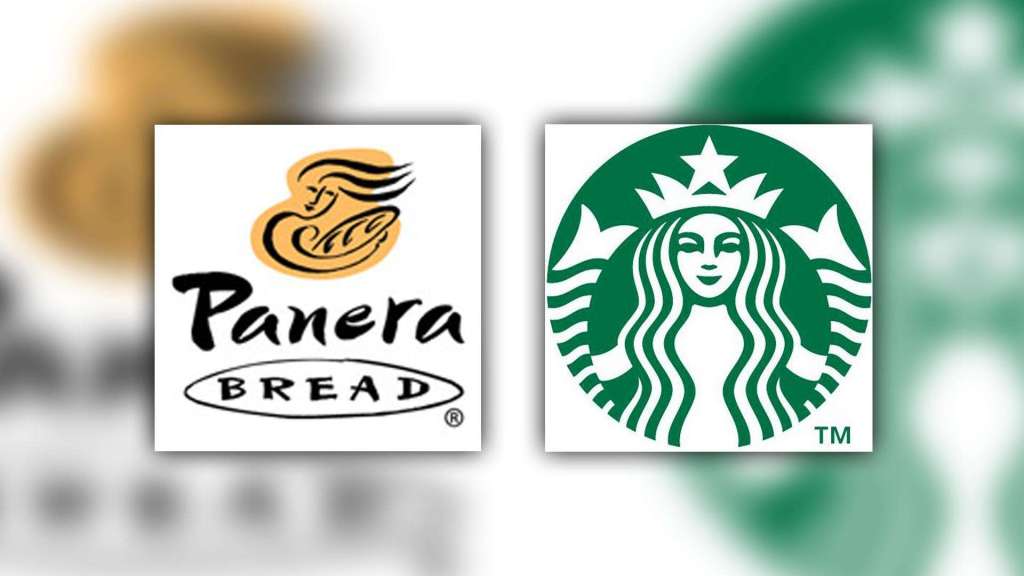
The Panera bread logo stood out to me because of its simplicity at first glance, and how it is easily overlooked. However, if you look at it for longer than a few seconds you can see there was much thought and research put into the logo. As you can see, the logo is subtle earthy colors with a woman holding a loaf of bread. The logo is simple however is complex in a way that it has a story behind the design. Panera although having more available than bread, includes a woman who they consider the “Mother of bread”. To understand the logo fully, one has to know that while making their famous sourdough, the bakers use a small amount of dough used to cook the previous batch of bread dough in the new one, and thus calling it the “mother”.

Panera Bread’s top competitor would probably be Starbucks and other local restaurants that serve sandwiches, soups and salads as they have similar menu to an extent. Starbucks has a similar logo in the aspect that they also have a woman as the main element of their logo, however Starbucks appeals more to a younger generation than Panera does through their more modernized, detailed logo.

2.Describe the target market (ie. what segments are being targeted)?  How do you know this is the target market? Did the company make good decisions to reach the target market?

From the design alone, from the subtle earthly colors represented and the “Mother of Bread”, the market Panera Bread is targeting is a young adult to mother. The font is a more calligraphy-like and flowy letter appealing to young adults trying to get away to a quiet location to work on work or homework. The lettering also appeals to mothers trying to get away from their kids for a little bit to meet up with old friends, or just for a break. The “Mother of Bread” makes it appealing to these mothers as they can relate to her and her calmness shown on her face. I think the company did make good decisions regarding the target market because people in these categories want to get away and feel calm, and with the subtlety of the logo I think they accomplish this goal. 

3. Does it work? Why or why not? Any general observations?

From the perspective of someone close to being in their target market, I believe it does work. Going in a Panera 90% of the customers are young adults and middle-aged women meeting with old friends or working on tasks on their computers. I think that they put a lot of thought into their logo and although not many people understand the true meaning behind it, is still visually appealing to their target market through their subtle colors and lettering.

Design a site like this with WordPress.com
Get started